Design Tokens
Posted Aug 2024
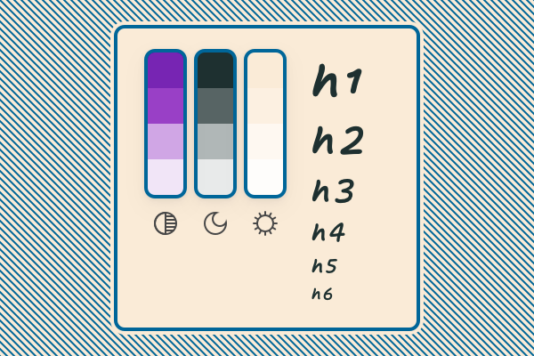
A brief intro and visualisation of design tokens
Design tokens are standardized, reusable variables that define the visual properties of a design system components: colors, typography, spacing, and style-related elements.
Working with design tokens ensure consistency and scalability across various platforms and products.
The Robot Show Podcast
Why read when you can listen? This NotebookLM show covers the article with an energetic, over-the-top, nauseating North American speech.
Why Design Tokens?
Consistency
One can easily and write 1em instead of 1rem. This type of mistake can be minor or critical, but regardless of the final result, it will eventually hurt the consistency.
Another example that comes to mind is border: red 1px solid;. Wouldn't it be nicer to have border: $border-red? It will be even nicer with once we add a semantic meaning (↓) to it.
Change Proof
At the 1st example below (↓) you can see the token change, no, actually change it yourself! This is super nice because, if built right (I'm using color-mix()), you can update one color and it will populate the other color variants, as well for the dark mode.
See the CSS below ↓
:root {
    /* This is the main color */
    --color-sys-main: hsl(180, 25%, 15%);

    /* These colors are interpolated using color-mix() */
    --color-sys-slight: color-mix(in hsl, var(--color-sys-main) 75%, transparent);
    --color-sys-dim: color-mix(in hsl, var(--color-sys-main) 35%, transparent);
    --color-sys-dis: color-mix(in hsl, var(--color-sys-main) 10%, transparent);
    --color-sys-none: color-mix(in hsl, var(--color-sys-main) 0%, transparent);
}

/* This is the dark mode override */
.dark {
    --color-sys-main: hsl(34, 78%, 91%);
}
Semantic Meaning
For consistency (↓) we have the pervious example of $border-red – which is a bad example of a token, as a proper token should bear a semantic meaning, i.e.: it shouldn't include the color’s name - but it should include the designation.
For example:
| Color | Meaning | Token |
|---|---|---|
| black | Text & general UI elements | --color-system |
| white | Background & general UI elements | --color-system-invert |
| red | Caution, distractive operations | --color-caution |
| green | Successful operations | --color-success |
| blue | Links & element focus | --color-link |
| hotpink | Brand color, primary | --color-brand |
Of course, keep in mind the following:
- You'll need to create variants not only as shown above – You'll need to take care of the dark mode, and other complexities that are unique to your use-case, for example:
--color-header,--color-borderor if more than one brand color then--color-brand-primaryand--color-brand-secondary. - These are just color tokens – but you'll need sizes, typography and such.
- As a rule of thumb, the bigger the product, the more tokens you'll need.
Theme Editing
Some products, like Pepperi, my workplace (2024), have a white label offering for the users to set their own design. It's just like the 1st example below (↓), but with a function that sets it into the style sheets.
In the attached video below, as mentioned before, you can see the color tokens, typography and their assignment over the different UI elements in action.
Reuse
There are two reuse use cases:
1st use case: DRY
Just like using components, you wouldn't write the same code twice (or more for that matter). This concept is known as DRY: Don't Repeat Yourself.
If we'll go back to our border example from before, well that's an easy example and one might say that writing border: red 1px solid; isn't that much of a different than border: $border-red – and they could be right.
But what about this CSS declaration?
@mixin desc-text-under() {
    color: var(--color-sys-slight);
    font-size: var(--step--1);
    margin-inline-start: var(--space-xs);
    display: inline-block;
    line-height: 1.25;
    margin-block: var(--space-xs);
    position: relative;
    &::before {
        content: '';
        display: inline-block;
        width: var(--space-4xs);
        height: 100%;
        background-color: var(--color-sys-dim);
        position: absolute;
        inset-inline-start: calc(var(--space-xs) * -1);
        border-radius: var(--border-radius-xs);

    }
}
This big declaration above is just styling for the silly description text under the img or video tag.
::lazy-img{src="/posts/design-tokens/slily.webp" alt="Description text under the "img" or "video" tag" desc="Description text under the img & video tags" style="max-width: 320px;"}
::
Wouldn't be nicer to include it with just one line? For example:
@include desc-text-under();
Much Nicer 👌
So we should think of styling types as tokens too! As it abstracts the mechanics of design into a a human readable context such as: desc-text-under.
2nd use case: Multiplatform
This is also happening at Pepperi – if you’re creating a design system for more than one platform – web, Android or iOS. All of them with a different syntax – so you're forced to write things more then once. In this case, using design tokens is the only reasonable way to have a cohesive and manageable design over the different platforms.
So let's say that if the Token is --color-caution-dim which is 50% opacity red, it will look like this:
| CSS (hsla) | Android (XML) | iOS (Swift) |
|---|---|---|
hsla(0, 100%, 50%, 0.5) | #80FF0000 | UIColor(red: 1.0, green: 0.0, blue: 0.0, alpha: 0.5) |
So every platform will manage its own syntax, but the name and its meaning is consistent across the products.
This site's tokens
This site is quite small so there are not many tokens, but I'm using them for - Colors, Sizes, Breakpoints, Typography and Shadows. I might refer to it in a later article.
For the sake of this article though I'll address just the color tokens.
Color Tokens Breakdown
Giving colors semantic meaning is important, so here's my naming convention:
- System Color – Its used for text color and most UI elements.
- System Invert Color – Its mostly used for backgrounds.
- Brand Color – You guessed it. Here I'm using it a my link color too
Each of them have 5 states; main, slight, dim, dis and none. You can see in the code block below how I structure it, or see it in action in the 1st Live Example below (↓).
The power or working like this, is that if one day you choose to change the system color, you'll just have to change it in one place, or two if you have dark mode.
1st Live Example; Updating Color Tokens!!
In this example you can update --color-sys-main and see its effect over the different color style. Since of the CSS setup shown above, all the colors are bound to it, so changing it will affect them all + the dark mode as well.
Will it look good? Probably not – Will it be accessible? No guarantees – Is it a good example? For sure! 😎
System Color
So here we have 5 variants of the system color.
Click on the color picker to see it in action.
--color-sys-main--color-sys-slight--color-sys-dim--color-sys-dis--color-sys-none
System Invert Color
And here we have 5 variants of the system-invert color.
Change it too!
--color-sys-invert-main--color-sys-invert-slight--color-sys-invert-dim--color-sys-invert-dis--color-sys-invert-none
Brand Color
5 variants of the brand color. Being used by links, icons and buttons.
Go ahead, see it in action!
--color-brand-main--color-brand-slight--color-brand-dim--color-brand-dis--color-brand-none
2nd Live Example; Updating SVG Tokens!
Following the article I've written about Simple Icon System, here you can see how you can easily update SVG size, border thickness & colors.
Well, that's the gist of it.
See ya'll in the next post 👋