Simple Icon System
Posted Dec 2023
Build a simple SVG icon system with Vue & Nuxt
SVGs are nice
Inline SVGs are nicer
SVG as components are the nicest
Check out the video or read the post? Why not both!
The need
This is what I need from my SVGs:
- To have them inline so I can use
CSS - To use
CSS varsandSCSS - Have them as components for a cleaner file
- To control them with
props - Reduce boilerplate needed for "good" SVGs
- Reduce the chance of variation, i.e. opinionated
The response – icon system
You can approach an icon system in two ways for design or for development
Icon system for design
In terms of graphic design an icon system is a collection of icons that work together as one group with consistency and harmony. Therefor there's a lot of similarly between the icons, like size, color, behavior and themes.
You can see in this link a nice example of an icon system I created for Pepperi B2B commerce company – it utilizes color tokens and is hooked up to Pepperi's theme editor. You can also checkout its Storybook in this link.
 Some of Pepperi icons ☝️
Icon system for development
In terms of development an icon system can help avoid repetition and boilerplate code, on the one hand. On the other hand it helps you keep consistency and to reduce the chance of human error.
It will reduce error and will keep it consistent because it's opinionated – there's only one of doing it, otherwise it just wont work.
And is will reduce boilerplate coding because you won’t have to write the same code needed to make the SVG robust and accessible, you’ll just write it once and every improvement or change will be automatically updated for all icons used.
Review the Icon System
This Icon System uses 2 Single File Components (SFC) to show 1 icon.
The 1st file is the SVG wrapper called SvgIconBase. It's a generic placeholder and will repeat for every icon. It contains the boilerplate code that keeps it robust and accessible and some props that will allow me to override colors and size at the instance level, if needed.
The 2nd SFC is called something like IconCool and it's unique for each icon. It contains the actual SVG drawing, title, description and every other unique, uncontrollable element of the icon.
The 2 components will look like this in the template tag:
<template>
    <!-- The wrapper -->
    <SvgIconBase>
        <!-- The icon -->
        <IconCool />
    </SvgIconBase>

    <SvgIconBase>
        <IconExtraCool />
    </SvgIconBase>
</template>
Now let's review these two files
The SvgIconBase SFC
What’s under the hood?
- Props: they all have default so you won't have to add anything to make it work:
viewBox: I use a 32×32, but I added it just in case. If you’ll make the all icons the same size in your design tool so you won’t have to change it.size: All my icons are square so the width and height props are bound (apparently binded is not a word)fillColor: As the name suggeststrokeColor: As the name suggeststrokeWidth: As the name suggest
- Boilerplate:
- To make it robust I use all the following:
baseProfile,xmlns,xmlns:xlink,xmlns:ev - To make it accessible I add a
role&aria-labelledbywith and ID for both the title and desc tags that will be typed in the 2nd file
- To make it robust I use all the following:
- To add the 2nd
SFCI’ll use theslottag and this is where the icon drawing will fit in - Just i case I've added a rect,
id="bounding-box"for better hovers regardless of the icons shape - For styling I added some
v-binds to the props to control the colors with CSS
Here's how the file looks:
<script setup>
defineProps({
    viewBox: {
        type: String,
        default: '0 0 32 32',
    },
    size: {
        type: String,
        default: '1.25rem',
    },
    fillColor: {
        type: String,
        default: 'none',
    },
    strokeColor: {
        type: String,
        default: 'var(--color-sys-slight)',
    },
    strokeWidth: {
        type: String,
        default: '0.125rem',
    },
});
</script>

<template>
    <svg
        version="1.1"
        baseProfile="full"
        xmlns="<http://www.w3.org/2000/svg>"
        xmlns:xlink="<http://www.w3.org/1999/xlink>"
        xmlns:ev="<http://www.w3.org/2001/xml-events>"
        aria-labelledby="title description"
        role="img"
        :viewBox="viewBox"
        :width="size"
        :height="size"
    >
        <slot />
        <rect id="bounding-box" fill="none" stroke="none" width="100%" height="100%" />
    </svg>
</template>

<style scoped>
svg, path {
    fill: v-bind(fillColor);
    stroke: v-bind(strokeColor);
    stroke-width: v-bind(strokeWidth);
}
</style>
The Icon SFC
For the icon drawing I tore apart the path form the the SVG and added title and desc tags.
<template>
    <title id="title">Cool icon</title>
    <desc>A cool example</desc>
    <path
        stroke-linecap="round"
        stroke-linejoin="round"
        d="..."
    />
</template>
Live Example
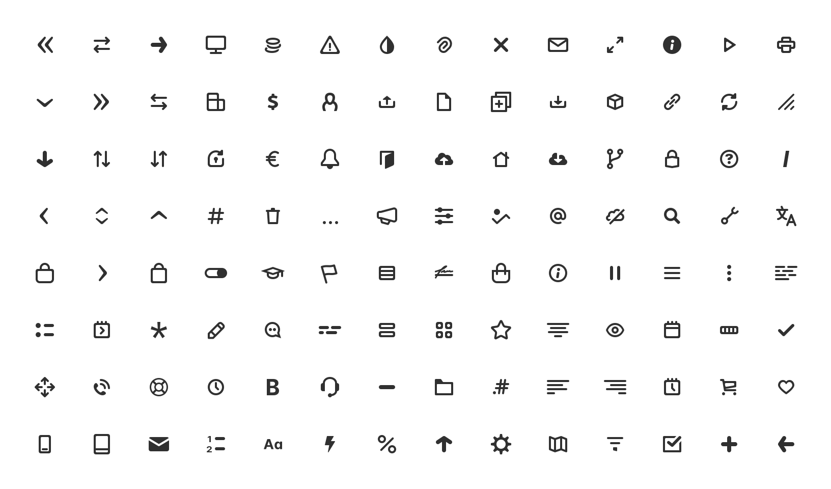
A few icons to play around with to show case the power of an Icon System. Of course this will make more sense when you'll have more then 3 icons 😋
Nuxt Setup
FYI, when placing a component in a sub-folder in the components folder, it derive the name form the folder name + the file name. So these 3 will be IconCool, IconCooler and ExtraCool
| components/
---| SvgIconBase.vue
---| icon/
-----| Cool.vue
-----| Cooler.vue
-----| ExtraCool.vue
That's All Folks
See ya'll next time