Pepperi Page Builder
How we shipped a self-service, custom web page builder for our B2B clients


Look, we get it - B2B clients need web pages that don't suck. That's why we built Pepperi Page Builder. It's a no-BS tool that lets businesses create, edit, and design their pages without writing a single line of code. Want to showcase promotions? Set up buyer profiles? Control your workflow? Done, done, and done.
Why We Built This Thing
Here's the deal: our clients kept asking for custom web pages. Makes sense - they needed to show their buyers (aka their clients) stuff like:
- Hot deals and promotions
- Available credit lines
- Fresh products
- Category breakdowns
- All that B2B eCommerce jazz
But they weren't just asking for any old pages. They wanted:
- Pages that look like they belong to their brand
- Total control over the design
- The ability to edit stuff whenever they want
- No more "wait for IT" bottlenecks
The Pain Points
Custom web pages sound great in theory, but man, they were causing headaches left and right. Here's what was going wrong:
- Pages looked like they were designed by different companies (because they were)
- Nothing matched our Pepperi Design System
- Our Professional Services team was drowning in page requests
- Pages weren't playing nice with other Pepperi stuff like:
- Our theme editor
- Header builder
- Native app
- Version updates
- Clients couldn't touch these pages without breaking something
- Our PS team became the bottleneck for every little change
Reality Check
Before we dove in headfirst, we needed to make sure we weren't building a solution looking for a problem. Here's how we validated our assumptions:
We watched what our clients were already doing:
- Starting 2017 some brave souls were building their own custom pages with devs and FS members
- Our PS team was getting swamped with homepage design requests
- At 2019 we built a plugin that allowed clients to edit content themselves, even if it meant wrestling with JSON files
- Leading clients were nodding enthusiastically at the idea
- Sales team confirmed people would pay for this
- Our marketing team's landing pages were getting traction


That JSON plugin? It wasn't pretty, but it proved something crucial: clients would rather edit a JSON file than wait for a developer to change their content. If they were willing to do that, imagine how they'd feel about a proper visual editor.
Research Time
Look, we're not the type to just wing it. We did our homework - and then some. Here's how we figured out what actually needed building:
- Field studies (aka watching what people were already doing)
- Talked to everyone who'd have to use this thing
- Card sorting (fancy way of saying we organized our ideas)
- Checked out what everyone else was building
Let's break it down.
1. Field Studies
Before we started cooking up new solutions, we took a good hard look at what was already out there. Smart move, right?
What We Had Going For Us
Here's the beautiful part - we weren't starting from scratch. Some of our clients had already cobbled together custom homepages. That meant we got to:
- See real pages that went through actual client feedback and revisions
- Watch how these pages evolved over time
- Learn what worked (and what definitely didn't)
Talk about a head start.
2. Getting Everyone's Two Cents
We needed to hear from everyone who'd touch this thing - from the folks building it to the people actually using it. So we assembled what we called our steering committee (fancy name for people who know their stuff):
- Dev team (the builders)
- Product team (the planners)
- Professional Services (the problem solvers)
- Pre-sales (the promise makers)
- Partners (the extenders)
- Selected clients (the real users)
We didn't just sit around and chat. We:
- Showed them what other page builders were doing
- Made them test drive tools like Wix, Squarespace, Elementor, and Tilda
- Watched them struggle (or succeed) with these tools
- Asked them what they loved and hated (and why)
3. Card Sorting: Start Making Sense
After collecting all this info, we needed to organize it somehow. Enter card sorting - our way of turning a mess of ideas into something that makes sense.
What We Got Out of It
Card sorting helped us:
- Figure out how people think about web pages
- Create a navigation system that doesn't suck
- Use words that actually mean something to users
- Sort out what's important and what's just noise
 Our card sorting session in action - looks messy, worked great
4. Checking Out the Competition
Let's be real - page builders aren't exactly a new idea. But we weren't interested in reinventing the wheel - we wanted to make a better wheel for B2B.
How We Did It
I always dig into competitor research - not to copy, but to learn. It's like getting a cheat sheet of what works and what flops. Plus, it helps me get inside our users' heads. Win-win.
What We Learned
We looked at:
- How others solved similar problems
- What features actually mattered
- What kind of language they used
- Their target audience
- Core features vs nice-to-haves
- How they handled responsive design
- Different content blocks
- UI approaches
- Customization options
- Pricing (because yeah, that matters)
Want to geek out over the full competitive analysis? Check these out:
Wireframes & Testing Ideas
Time to put our research to work. We started rough and refined as we went, testing everything with real users along the way. No point building something pretty if it doesn't work, right?
The Big Decision: How to Edit
After looking at a bunch of page builders, we spotted two main ways to handle editing:
Option 1: Edit Right Where You See It
The Wix and Squarespace approach: editing panels pop up right next to what you're working on.
The Good
- Everything's right where you need it
- Clear connection between what you're editing and what changes
- Space-efficient
The Bad
- Better for tech-savvy folks
- Can get messy with lots of floating panels
 Option 1: Edit where you see it
Option 2: Sidebar Editor
The Elementor way: everything you need to edit lives in a sidebar.
The Good
- You always know where to find things
- Less jumping around the screen
- Perfect for occasional users
The Bad
- Takes up more screen space
- Editing feels less direct
 Option 2: Everything in a sidebar
We went with the sidebar editor - here's why
- Development Reality: Our dev team pointed out that floating panels are a pain to build right. Why make their lives harder?
- User Reality: Most of our users aren't web designers - they just want to get stuff done without learning a whole new system.
Low Level Wireframes
After picking the side panel approach, we had two ways to handle the editing experience. The devil's in the details so it's time for more decisions!
Option 1: One Panel to Rule Them All
The Good
- Keeps things tidy
- Less screen clutter
The Bad
- More clicking around
- Easy to get lost in the navigation
 One panel, lots of drilling down
Option 2: The Dynamic Duo (Fixed + Changing Panel)
The Good
- Faster editing
- Less back-and-forth
The Bad
- Takes up more precious screen real estate
- More stuff to keep track of
 Two panels: one fixed, one flexible
We went with Option 1: The Single Panel
When you're building web pages, screen space is like beachfront property - too valuable to waste
Test Time
Before jumping into full-blown development, we needed to make sure our wireframes actually made sense in real life. You know what they say - everyone has a plan until they try to drag and drop a slideshow block.
Interactive Mockups
We built clickable prototypes of our designs and let our steering committee loose on them. Nothing beats watching real people try to use your stuff.
What we tested:
- Navigation flows
- Content editing workflows
- Block placement and management
- Settings and configuration panels
- Mobile responsiveness
The good part about catching issues here? Way cheaper to fix than after writing actual code.
 Our steering committee putting the prototype through its paces
What We Learned
The testing sessions were eye-opening (and sometimes ego-bruising). Here's what we discovered:
- Navigation Clarity
- Users got the sidebar concept right away
- Some confusion about how deep the drilling-down went
- Added breadcrumbs to help with orientation
- Content Editing
- People loved the direct preview updates
- Some settings were buried too deep
- Reorganized common actions to be more accessible
- Block Management
- Drag and drop was intuitive
- Section resizing needed work
- Added quick actions for common block operations
Phase Takeaways
This phase was crucial for:
- Validating our core UX decisions
- Finding pain points early
- Getting buy-in from future users
- Building confidence in the design direction
Time to turn these prototypes into the real deal
With validation from actual users, we were ready to move into high-fidelity design
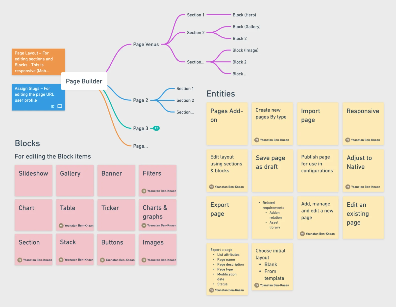
Final Design Magic
Alright, let's get into the good stuff - the actual product. Here's where all that research and wireframing turned into something real. We'll break it down into two parts: the basic building blocks and the fancy features that make pages pop.
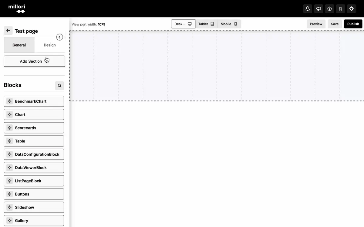
The Basics: Page-Level Tools
Pages Manager: Mission Control
Think of this as your command center. Create pages from scratch, grab a template, or manage what you've already built.
What you can do:
- See all your pages at a glance
- Spin up new ones
- Clone what works
- Trash what doesn't


Page Layout: The Foundation
This is where you build your page's skeleton. Drag, drop, and make it your own.
The power tools:
- Drag-and-drop everything
- Set up sections your way
- Control spacing and width
- Add custom logic (yeah, we're fancy like that)


Mobile Magic: Hide & Preview
Because let's face it - what looks awesome on desktop might look wonky on mobile. We've got you covered.
The cool stuff:
- See changes in real-time
- Preview on any device
- Hide sections that don't work on mobile
- No more "it looked good on my computer" moments


The Cool Stuff: Content Blocks
Slideshow Block: The Showstopper
Perfect for making your promotions pop. This isn't your grandma's slideshow.
What You Get
- Full control over slides (text, images, buttons - the works)
- Design options that actually make sense
- Smooth transitions that don't make people dizzy
- Smart logic based on user roles
 Your promotions never looked this good
 Mix and match controls, overlays, and layouts
Behind the Scenes
 All the controls you need, none you don't
Gallery Block: The Grid Master
Show off your products in style. Think Instagram grid meets B2B sensibility.
 Products looking pretty in the grid
 Mix it up with different layouts
Make It Yours
 Point, click, perfect
Banner Block: The Attention-Grabber
When you need to make an announcement that can't be ignored.
 Banners that mean business
 Different styles for different messages
Design Central
Make it yours in a few clicksButtons Block: Call-to-Action Central
Because sometimes you just need people to click stuff.
Button Styles for Days
- Solid buttons when you mean business
- Subtle ones for the gentle nudge
- Outline style for that "hey, over here" vibe
- Add counters to show what's hot
 Buttons that get clicked
 Mix and match for maximum impact
Control Center
 All the button options you never knew you needed
The Supporting Cast
We've got more blocks than a LEGO store. Here's what else you can throw in:
Rich Text Block
For when you need to write more than three words.
- Format text like a pro
- Drop in images and videos
- Make it look good
 Write away - it'll look good
Chart Block
Because sometimes you need to show off those numbers.
- Pull in data from your dashboard
- Pick your chart style
- Watch the data tell its story
 Data visualization that doesn't hurt your eyes
Filter Block
Help people find stuff faster.
- Smart filtering options
- User-friendly design
- Quick access to what matters
 Finding stuff made easy
Live Chat Block
Because sometimes people just need to talk.
- Real-time chat support
- Works with your existing chat tools
- Keep the conversation flowing
 Talk to your people
The Results: Did It Actually Work?
Look, features are cool and all, but let's talk about what really matters: did this actually solve problems and make money? Spoiler alert: yeah, it did.
How Do We Know It Works?
Eating Our Own Dog Food
First off, we put our money where our mouth is:
- Started using it for Pepperi's own pages (if we won't use it, why should anyone else?)
- Got our team hooked on it for internal stuff
- Used feedback from our own people to make it better
Market Love
But the real test? Other people actually wanted to use it:
- Clients from different industries jumped on board
- People started asking for it before we even pitched it
- The "when can we get this?" emails started rolling in
The Homepage Revolution
Remember how creating custom homepages used to be this whole big thing? Had to get developers involved, took forever, cost a bunch? Yeah, we fixed that.
The Business Impact
- Opened up a whole new revenue stream (cha-ching!)
- Existing clients keep coming back for more
- New clients showing up just for this feature
Show Me The Numbers
Sales (Because Money Matters)
- Created a whole new revenue stream (cha-ching!)
- Existing clients kept asking for more
- New clients came knocking specifically for this
Let's talk money - because at the end of the day, that's what keeps the lights on. Our page building journey didn't just solve problems; it created serious business value.
Numbers are in millions, but legal says I can't show the exact figures. Trust me, they're good.
See those spikes? Each one tells a story:
- 2017: Custom webpages hit the scene - handcrafted and expensive
- 2019: JSON plugin drops - sales jump as clients get their first taste of control
- 2022: Beta testers join the party - revenue climbs despite limited release
- 2024 Q4: Full release incoming - stay tuned
Resources (The Stuff We Saved)
- No more developers pulling their hair out over custom pages
- Clients actually handling their own content (what a concept!)
- Ditched a ton of technical debt from old custom solutions
Usage (People Actually Use It)
- Both business users and buyers are all over it
- Clients updating their own stuff (and loving it)
- Template library growing like crazy
- Pages getting updated way more often
- Support tickets for page changes? Down like crypto in 2022
What People Are Saying
The Tech Folks
We talked to PS teams, admins, and IT people. Their take?
- "Finally, we can work on actual tech stuff!"
- "No more emergency calls about changing a banner"
- "Updates don't break everything anymore"
The Business People
Marketing and sales managers can't shut up about how:
- Campaigns that took weeks now take hours
- They can actually change stuff without begging IT
- When opportunity knocks, they can answer right away
- Their brand actually looks consistent now
The End Users
The people actually using these pages? They're fans because:
- Pages don't look like they're from 1999 anymore
- Content is fresh (because it's easy to update)
- They can find what they need
- Everything loads faster than a caffeinated cheetah
The Big Wins
Let's break it down:
- Clients can handle their own content (like grown-ups!)
- Tech teams can focus on actual tech stuff
- New pages and campaigns launch faster than a rocket
- Everything looks professional (even when Dave from accounting helps design it)
- The whole thing actually scales without breaking
What's Next?
We're not done yet. We've got plans. Big plans. Like:
- More block types (because you can never have too many LEGOs)
- Smarter templates
- Even easier editing
- Maybe some AI magic (because why not?)
But for now? We turned a major pain point into a money-maker that makes everyone's lives easier. Not bad for a page builder, right?
Remember how clients used to beg for custom homepages? Now they're building them themselves, making them look good, and doing it all without writing a single line of code. Mission accomplished.